Showing posts with label maps. Show all posts

Wednesday, October 24, 2012

Does it matter? I mean, he's going to bomb, uh, all of them, anyway.

Still, it's worth noting that our boy Willard is about as good at geography as he is at math.

The really weird part is, he keeps saying this same thing, despite strenuous efforts by fact-checkers to get him to stop.

In conclusion, if by some chance he should lose this election, I hear there's an opening that he'd be perfect for, in the cartography department at FoxNews.

(pic. source)

Saturday, September 29, 2012

A cool new Labs feature on Google Maps

If you would like to be able to click on Google Maps and get exact point-to-point (-to-point-to-point …) distances, do the following.

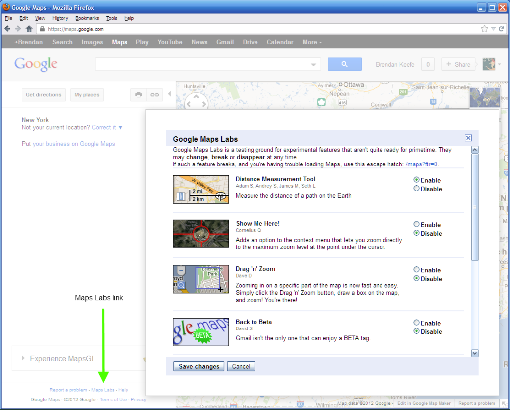
Go to maps.google.com. In the left column, way down at the bottom, click the link labeled "Maps Labs." You'll get a pop-up. Click the Enable button next to "Distance Measurement Tool." At the bottom of the pop-up, click Save. (screenshot)

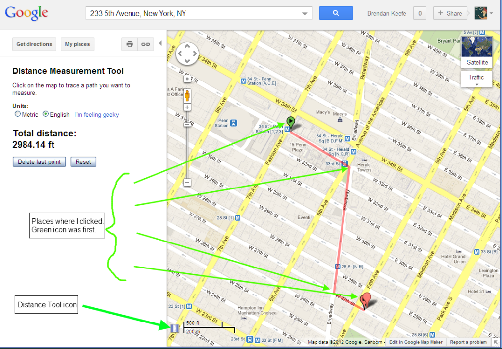
You'll now see a tiny ruler icon, just to the left of the distance scale, in the lower left corner of the map. When you want to determine a distance, click that. Then click once on the map at your starting point. Click a second time for your end point (as the crow flies, maybe), or click a series of places, wherever you'd have to turn a corner, say. (screenshot)

Click the little ruler icon again to make the distance tool stop. Click the Maps Labs feature again if you want to disable it.

Happy map nerding!

I really like the Delete Last Point feature, which can be clicked repeatedly, if you'd like to backtrack.

I haven't yet remembered to get out my 100-foot tape measure to see how accurate this tool is, but some day, when it's dry . . .

Friday, March 02, 2012

Fizzy logic

Distribution of "pop," "soda," and "coke" usage, as determined by an analysis of tweets:

Yellow dots indicate “pop,” red dots indicate “Coke,” and blue dots indicate “soda.”

Zoom out and wonder along with me why Canadians use the term most prevalent in the US southeast.

Bigger and even more more interactive map here.

Bigger static maps, showing results from different workers using different methodologies, here.

More info, and topics, starting at Jennifer Schuessler's fine post. Wherein, concerning some matters discussed, this blogger needs educated. But it's all hella cool!

Sunday, February 26, 2012

According to science, Rhode Island borders New York!

Cartographic science, that is!

I wouldn't have believed it, either, ...

... but I got to wondering how far away I was from a restaurant the NYT mentioned, and then, well, you know how it is when you start looking at a map.

Think you could win a bar bet on the title of this post? Try it! And if they still don't believe you, well, you know what to say.

Thursday, December 15, 2011

Nice to start off the day with a small victory

Screenshot of an email from Google Maps notifying me that I correction I had proposed was reviewed and agreed with(embiggen)

Nothing like being validated by one of the world's most powerful companies!

By the way, if you're a map nerd, Google Map Maker is fun.

And speaking of which, I just got my first addition to that approved two days ago, too! This is excitement matched only by the first time I clicked Edit on Wikipedia and fixed something like it pays attention to it's apostrophes or it gets the hose again.

Thursday, December 08, 2011

Embrace your parochialism, my fellow New Yorkers!

If you thought Saul Steinberg's View of the World from 9th Avenue …

… was not so much humorous as just plain sensible, then you're gonna love Harold Cooper's ExtendNY.com.

What's it all about? Here's a hint: Two of my favorite structures are at 4724th Avenue and S 9666th Street, and at E 12,928 Avenue and 63,975th Street.

(h/t: WCBS 880 | pic. source: Strange Maps)

Monday, August 30, 2010

Advice Too Often Not Followed

I wish more people would listen to Steven Pinker (and his early editor):

I’ve gotten advice on writing from an early editor of mine who said, “When you try to present science to a wide audience, don’t feel that you’re writing for truck drivers or chicken pluckers. They probably realistically won’t buy your book. And if you try to aim at everyone, you’ll end up talking down or condescending. Write for your college roommate, someone who you respect as being as smart as you. They went into a different line of work. They’re joining the conversation late. They need to be brought up to speed; but assume that your audience is as intellectually engaged and as smart as you are.” That was terrific advice both for teaching, and for writing and speaking for a wide audience.

Video interview and transcript of "Steven Pinker on Writing About Science" on Big Think.

BTW, I only happened across Big Think because I happened to be checking Lindsay Beyerstein's Twitter feed. (She's now blogging there, and has archived Majikthise, and ain't I late to the party.) Lots of other blogs there, too, plus various series, like this month's "Dangerous Ideas." Have a look.

[Added] In other things you might already know, but which I didn't, I see Strange Maps also has a new home, at Big Think.

Saturday, August 14, 2010

World population graphed as a function of latitude and longitude

For no particular reason; just that it's a cool chart:

Two world maps overlaid with bar chart of population keyed to latitude and longitude, respectively

Pic swiped from Paul Kedrosky, via a tweet from Christopher Mims.

Following the link from the former, it looks like it was put together by Bill Rankin, who is pursuing a dual Ph.D., in the history of science and architecture at Harvard, and who enjoys graphic design and cartography in his spare time. Either this guy has 72 hour days and no need for sleep, or I am even more inferior than I thought, but never mind that. The above chart appears here, on his hobby site, Radical Cartography. From the home page, follow PROJECTS → BROWSE BY GEOGRAPHY → THE WORLD → POPULATION to get there, if the "here" link doesn't work. Be advised that if your tastes for nerd eye candy are at all like mine, you risk losing the rest of the day.

[Added] I am by no means close to being done browsing this site, but I wanted to note that I particularly liked the "Underdevelopment" map of Manhattan.

[Added2] Animated map of time zones: slow | fast.

[Added3] A new word! endorheic, a geographical term which means an internal basin that does not drain outwardly. Not all water, it turns out, ends up in the sea. Who knew? From the Physical Geography page.

[Added4] World railways. Be sure to download the full-size image.

[Added5] U.S. Empire.

[Added6] From a link in the Research Candy section of Bill's academic page: "graph of the development of the US patent system." (PDF) Note especially the one titled "Patent Activity (per million population)."

[Added7] From same section: "graph of US construction activity, 1915–1960."

[Added8] Back to the RadCart site: "Place-Name Etymology."

Thursday, October 02, 2008

Please Don't Vote

Voting info below. But first, enjoy the best PSA ever:

(alt. video link)

(alt. video link, with bad words bleeped, for sharing with your sensitive friends)

maps.google.com/vote


Follow that link, type in your home address, and you'll be able to find out:

  • Whether you're already registered to vote
  • How much time you have left, if not
  • How to get an absentee ballot
  • Where to get more voter information

among other things.

(h/t: Oliver Willis)


Another handy site for checking your registration status and finding other information about voting:

VoteForChange.com


Saturday, May 17, 2008

The Appalachian Problem

You've probably seen overlay maps of the Appalachian region during the Democratic primary, showing Hillary Clinton's domination over Barack Obama. Charles Blow takes another look in today's NYT. Pretty interesting, especially the graphic.

The takeaway: the region went heavily Republican in 2000 and 2004. Obama probably can't change that. But he might be able to defuse it by winning states on its northern edge -- Pennsylvania and Ohio -- and maybe also Virginia. Blow treats New York as part of this "northern frontier" strategy, but I think this is a crock. I can't imagine NY not going blue.

I suspect the key for Pennsylvania and Ohio will be, in large part, boosting urban voter and college student turnout. But maybe he'll be able to make some inroads among the more rural areas, through a combination of his personality, educating people about McSame, and a good choice for VP. Not enough to win, probably, but enough so that the urban and youth vote has a better chance of outweighing the white rural vote.

Friday, April 04, 2008

Looks like I picked the wrong week to give up hard liquor**

Stop the presses. Michelle Malkin is outraged.

Yes, yes, I know. Forget about "dog bites man." This is about as unusual a story as "dog poops."

The occasion this time?


A vodka ad, created for billboards and other outlets. In Mexico.

Absolut-ly

Observing the quickly loosening fastenings on display over at Michelle's Hub of Horrors,* I'm about ready to go buy a quart or two. Seems like a good time for a screwdriver.

Once I mix said drink, I will join John Cole in toasting Jeffrey Moran, the Absolut exec apparently responsible for the ad. Here's the reply email the wingnuts are getting in response to their outraged missives:

Your message

To: Moran, Jeffrey
Cc:
Subject: Offensive ad
Sent: Thu, 3 Apr 2008 15:18:30 -0400

was deleted without being read on Thu, 3 Apr 2008 16:28:51 -0400

(pic. sources: 1, 2)


* No. No link. Surprising as it may sound, I do have some standards. Maybe it's only one drop not in the bucket, considering the zillions of links she'll be getting from her fellow xenophobes, but the parching of her brand of hatred has to start somewhere.

** (cf.)

Tuesday, March 04, 2008

More Texas Strangeness

I am looking at the nice rollover map that the NYT offers, and I notice a number of counties where the pop-up report reads: "100% reporting, 0 votes."

It does not seem that any of the counties that do show this show it for both the Democratic and Republican maps/results. Is it possible that some of the counties in Texas are entirely composed on members of one party or the other? Anyone got a better answer?

ShareThis