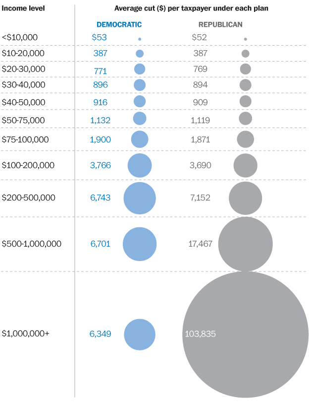
Along the lines of the previous post, here is another chart also courtesy of Ezra Klein. Another beautiful example of the visual display of quantitative information, i'n't it? Click it to big it.
Next time you hear some Republican politician describing his plan to Get This Economy Going By Preserving Teh Bush Tax Cuts, just remember: gray goo.
Let us all praise Paul Ryan!!!1!


No comments:
Post a Comment